Posted by Mike McDermott on
Presto Labels helps many small business owners with their labeling needs. Each business owner has a great story behind their brand; a great passion, a great cause, or a great purpose. I would like to tell you about one of our customers, sammysoap®.
Sammysoap is layered with all sorts of passion, cause, purpose, and heart. First and foremost, sammysoap has taken an ordinary product and is manufacturing it in an extraordinary way. Each generous 4.5-ounce bar of soap is handmade, 100% all natural, with no fragrance, preservative, dyes or any other synthetic ingredients. They substantiate fair trade supply chains, use sustainable packaging and reinvent, reuse, and recycle everything they can. Sammysoap’s products do not harm the planet, are cruelty-free, waterway, food area, child, and pet-friendly. Each small batch is artistically handmade and packed with a purpose.
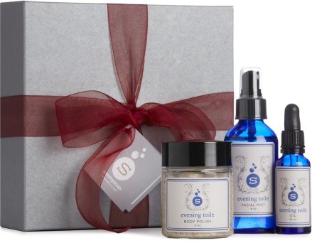 This company was created to serve a purpose; to create jobs for adults with intellectual disabilities. “A job creation machine, disguised as the world’s best soap company” is touted on their website. Sammysoap is a for-profit business supporting disability wage equality, human health, and a clean planet.
But what is most incredible about this company is its heart. This company exists because a mother’s mission was to create a business to provide her son with a fulfilling and useful life. This company provides adults with intellectual disabilities the opportunity to develop skills, earn a fair and equal wage, and be productive, proud members of a community. Please watch their video. I think you will enjoy their story, and you also might want to try their incredible products too.
Their video: Redefining Normal
Posted by Mike McDermott on
When printing an order for the first time, or changing your label printer, it is difficult to imagine what the final printed product will look like. Every press prints a bit differently and different presses use different types of inks, which look different when applied to different substrates. All these variables will affect how your label will look when printed. To alleviate the unknown before you invest in a full label run, Presto Labels offers a variety of proofing options. Let’s look at the different types of proofs, and why Presto Labels offers each type.
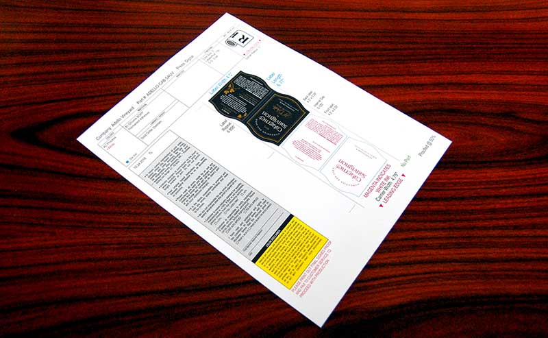
After submitting your artwork, the pre-press department will email you a digital PDF proof, free of charge. Digital PDF proofs are for layout proofing purpose only. They are not an accurate representation of color or quality. When you receive this digital PDF proof, check it carefully. Most of the time, this will be the last chance you have to make any changes or corrections before your labels are printed.
Here are things to check when you receive your digital PDF proof:
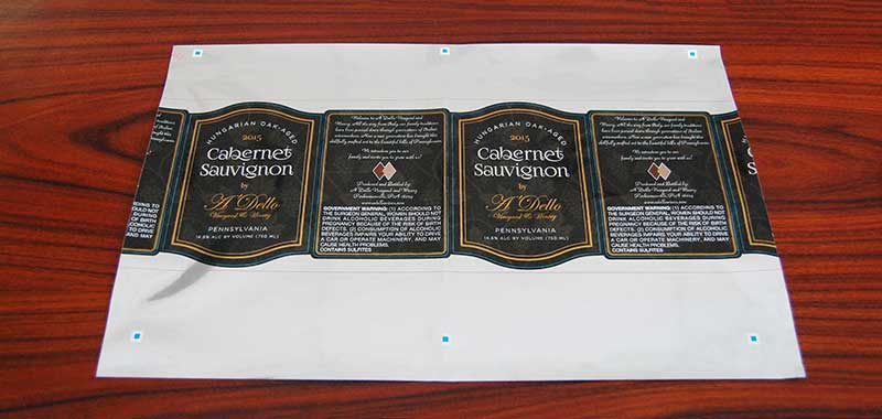
If you have apprehension about how your labels will look when printed, especially if you want to match a color or spot PMS color, if you are printing your labels for the first time, or if you are using a new material, it is a good idea to order a press proof. Press proofs are provided at your request, for a cost. They allow you to see what your label will look like before you spending money on a full print run. Press proofs are printed directly from our press, on specified material, and with varnish as specified on your order. Press proofs are not cut to size, but we do print the dieline (cut line) so you can see the size and shape of your label. Press proofs represent accurate print, material, color, and quality and are shipped to you overnight.
Spot PMS colors cannot be matched 100%. PMS colors must be converted into 4-color process colors on our digital press. The press proof will show you how close we can get to the sample you submitted, or to the PMS color you requested.
Here are things to check when you receive your press proof:
1) The label looks like you wanted it to.
2) Colors are acceptable.
3) The text is clear and easy to read.
4) The material provides the look and feel you wanted to achieve.
5) The dieline shows how you want your label cut.
6) Double check your spelling and grammar. Don’t let a typo go to press!

If you would like your press proof to be printed and cut to size, you want to order a press proof & laser cut. Press proofs are printed directly from our press, on specified material, and with varnish as specified on your order. These press proofs are also cut to the size and shape specified on your artwork with our lasers. Press proof & laser cut represents accurate print, material, color, cut and quality, and are shipped to you overnight. Press proof & laser cut will cost more than a press proof that has not been cut.
Press proofs, and press proofs that are laser cut, tell you a lot more about how your label will look than a digital PDF file. By investing in a printed proof, you will be able to confirm that what we print is what you want–before spending money on a full production run.
Have additional questions about our proofs or artwork requirements? Give us a call at: (877) 830-3851 or email customerservice@prestolabels.com and we’ll happily help to answer your questions.
Posted by Mike McDermott on
It happened. No one’s perfect. Somehow, your seemingly print-ready design wasn’t so perfect, and now you have labels that seem unusable. It doesn’t matter who’s to blame, it just needs to be fixed asap! Believe it or not, this is not the trash it and start over emergency that it appears to be – with a little rework and redesign, Presto Labels can cover the mistakes with a blackout material label.
Sometimes called a cover-up label, blackout materials can help to fix small design issues, like a UPC bringing up the wrong price, a misspelling, or another misprint. Basically, any text or graphic design issues can be solved with a cover-up label.
When we help our customers with labels that weren’t so perfect to start with, we have a few goals to achieve the best possible outcome. First, we want to make sure that the mistake cannot be seen under the new label. Next, we want to make the solution seamlessly fit the original design. It’s bad enough you know it’s there, we want to be sure that everyone else sees a polished, finished product. Last, we want to make sure that you’re not out the money on the original printing, and blackout materials can save you money compared to a total reprint.
As soon as you know that you need a correction to a label, let us know. We can work with you to design the blackout material label, or if you have a finished artwork file, you can send that over to us. Once the file is received, we can review the artwork and create a prepress proof. Be sure to have extra eyes review the proof to make sure it will solve the problematic original label. Once the proof is approved, we can work with you to determine the perfect cover-up material, then get to work printing!
Don’t let design, font, misspellings, and other errors and issues cause you to have a meltdown. Presto Labels can send you samples of blackout cover-up labels, and we can walk you through our process to help you fix these mistakes, meaning your customers will only see what you want them to see.
If you have any questions about blackout material options, or need help with a cover-up label, contact us!
Posted by Mike McDermott on
As a small to medium-size business, your livelihood hinges in great part upon your ability to gain market traction through your product labeling. An eye-catching, professionally-made BOPP label can often be the key to captivating prospective buyers. Below is a look at BOPP and some of the many benefits it offers as a trusted label solution.
“Bi-Oriented Polypropylene (BOPP) refers to the manufacture of polypropylene films using an orienting system. BOPP films are manufactured using a tenter frame sequential process or the double bubble process, in which a polypropylene (PP) film is oriented in two directions (machine and transverse directions).”
– Dow Chemical Company
BOPP is an acronym for biaxially-oriented polypropylene, or the use of a special process to manufacture polypropylene films. In a nutshell, BOPP is polypropylene that has been stretched in two different directions; hence the “biaxially-oriented” component of its name. BOPP films were introduced in the 1970s and have risen in popularity as a means of packaging and labeling food and many other products. BOPP is often used for packaging and labeling of bottles, food products, cleansers, and other household products.
Aside from paper, BOPP is the most popular material of choice for labels. BOPP’s proven performance and affordability have combined to make it the preferred label material for manufacturers in a host of different specialties. Here are just a few of the industries that are choosing BOPP for their labeling applications:
BOPP’s popularity has increased immensely over the past two decades. Its durability, adhesive properties, and resistance to the elements have propelled BOPP to its position as a leading material for digital labels and tags. BOPP is also cost-effective and versatile, making it a top option in the label printing industry. Here are some of the top benefits of BOPP:
Unlike labels made with most other materials, labels created with BOPP film can be exposed to cold water or high levels of humidity without eroding. They are therefore a top choice for manufacturers whose products are frequently exposed to moisture or humidity.
BOPP’s low toxicity is a primary reason why BOPP is used with labels for food and hygiene products. BOPP emits no harmful gases and polypropylene flakes or dust is not harmful. Finally, there are no special requirements for safe handling, other than avoiding spilling BOPP, which can cause a person to trip or fall.
One of BOPP film’s greatest assets is its variable translucency. Labels fabricated with BOPP film can be clear, white, or metal-colored. The clear option is especially popular among food packagers and manufacturers who want consumers to be able to view their products through a clear label, while white-colored BOPP is a common choice for lip balm and other hygiene products.
“A number of standard test methods are used in the United States to measure the peel adhesion or bond strength of pressure-sensitive labels. These include ASTM D 903, ASTM D 3330, ASTM D 6252 and the TLMI 180° Peel Adhesion-Face Stock test method.”
– Don Eppink, Adhesives and Sealants Magazine
Adhesive strength is one of BOPP’s greatest assets. When customers invest in BOPP labels, they can enjoy peace of mind knowing that they have selected a label that demonstrates stellar peel adhesion properties, even with labels designed for round or curved glass bottles.
BOPP’s resistance to solvents and acids make it a great choice for labels – especially those applied to household products and certain foods and beverages. For example tomatoes, beans, coffee, and some citrus fruits can be highly acidic. Even though they might not ever touch the label on the outside of a can, they may emit some gases that can cause most non-BOPP labels to deteriorate.
“The main features of BOPP films are improved stiffness, high tensile strength, excellent optics and good water vapor barrier properties. BOPP films range from 15 to 50 microns and are most commonly 15 to 30 microns…Additionally, BOPP films can be treated with acrylic and PVDC coatings for better sealability and barrier properties.”
– Dow Chemical Company
Durability is the cornerstone of longevity for a printed label. BOPP is known for its strength and ability to endure significant wear and tear. Its plastic-based construction make BOPP far more durable than paper labels. Additionally, top label printing companies cure their printed designs to further increase their durability and resistance to the elements.
Even with all of the practical benefits BOPP offers, you cannot ignore BOPP’s gorgeous appearance. In addition to offering a higher clarity and gloss, BOPP’s higher tensile strength sets the perfect foundation for digital printing. And with its stellar durability, BOPP labels stand the test of time while paper labels deteriorate.
“According to the report projections, the global BOPP films for packaging market is expected to witness a CAGR of 6.0% from 2017 to 2025. In 2017, the market was worth US$ 13,669.4 Mn and is expected to touch a valuation of US$ 21,736.5 Mn by the end of 2025.”
– Persistence Market Research
Given the many benefits BOPP brings to the label design table, it is no surprise that BOPP’s popularity continues to grow. Market researchers across the globe point to the rapidly increasing demand for sophisticated, cost-effective packaging as a key factor that will drive the continued growth of BOPP. In fact, Persistence Market Research forecasts that the market will rise to over $21,736 million USD before 2026.
As outlined above, there are many benefits to selecting a label made with BOPP material. However, there is more to creating a label than choosing the material. The best way to ensure that you select the perfect label for your products is to seek the guidance of an industry expert. The experts with Presto Labels have perfected the art of label printing and are eager to help you select the best label for your products. Here are just a few of the many reasons why you should choose Presto Labels for your label printing needs:
We invite you to contact us to learn more about the many ways that BOPP can enhance your branding. Our skilled label design experts have the tools and resources to create professional labels that will make your products stand out. We are happy to provide you with an instant quote and look forward to becoming your trusted resource for all of your labeling needs!
Posted by Mike McDermott on
Did you know consumers recognize color before they read text or focus on other imagery? One study, called Impact of Color in Marketing, found that 90 percent of snap judgments are made about products based on color alone. However, selecting a color is only the first step. Protecting its integrity is just as vital. Color is especially important for new companies trying to establish their brand. Another study reported by Entrepreneur magazine found that colors influence the perceived “personality” of a brand. To maintain brand recognition and differentiate products from competitors, entrepreneurs must find a trusted printer. Is your printer using a process that ensures quality and color consistency while keeping your project on budget? Two processes that portray a gamut of colors are 4-color and spot color printing. What’s the difference?
What is 4-Color Process?
Process color, also called CMYK, is the most common method of printing. If you’ve ever had brochures, posters, flyers or any other marketing materials printed in full color, most likely they were printed using 4-color process. CMYK stands for cyan (C), magenta (M), yellow (Y) and key (K), or black. The order of the letters is significant because it represents the general order of the printing process. When an offset or flexo printer prepares your art files, they are separated into cyan, magenta and yellow printing plates that are “keyed” or aligned with a black plate. When printing with a digital press, the computer separates the artwork into CMYK when printed with ink cartridges, much like your home computer’s printer.
How does it work?
How are so many shades created from just three primary colors and black? Printers accomplish this through a process called halftoning. Instead of full-saturation, the primary colors are printed in varying patterns of tiny dots in a layering sequence. For example, to the naked eye red appears as a brilliant continuous tone. However, if you looked at the printed red color under a magnifying glass, you would see dots layered in patterns to make up the red hue.
Can such a process really create consistent tones? Absolutely. Modern technology allows for endless degrees of saturation that are actually very precise to specific colors. If you need a certain hue of red, your printer knows exactly the saturation of magenta and yellow needed to give you the same brilliant red, every time, across multiple marketing mediums.
What is a Spot Color?
Unlike 4-color process, spot colors are solid colors. For example, if you want red, it will be mixed ahead of time and printed as a pure ink, not a mix of magenta and yellow dots. Color specification systems, such as the Pantone Matching System (PMS), provide specific recipes for the desired spot color. Graphic designers can pick a specific shade from their swatch book, giving the printer exact specifications. In turn, the printer orders that specific ink. Spot colors provide the most stable, predictable color results.
What Process Should I Use?
If spot colors are the most predictable colors, why not use them all the time? Spot colors are unique, and unique is going to cost more. Many entrepreneurs simply don’t have the budget to print using spot colors. Spot colors are customized and purchased specifically for a client. In addition, printers spend more on press setup time when customized spot colors are being used, an added expense that is also passed along to the customer. New digital printing presses utilize 4-color process technology that cannot insert PMS colors without purchasing very costly customized color cartridges.
With 4-color process, printers cannot guarantee custom color matches for all colors, but they can closely match a wide range of hues. Many PMS colors have fluorescents added for brilliance, which CMYK cannot duplicate. Colors will also vary when printed on different presses, different materials and when using different inks (such as water-based ink vs. UV inks). Let your printer know if matching a color is critical. Provide them with either a solid Pantone® color or with a printed sample, and request a press proof. Even though most printers charge an additional fee for a press proof, it’s really the only way to see what your artwork will exactly look like when printed.
Maximum Impact
Yellow arches. A red can of cola. We instantly know these brands, not because of the writing, but because of their unique colors. Color is the dominant source of identification for brands. Consumers instantly recognize their favorite label on the aisle by scanning for color. A study from Kissmetrics found that 93 percent of consumers place visual appearance and color above all other factors when making a purchase. Do you have a recognizable brand or are you working on one? Carefully select the colors for your brand and labels, and entrust the integrity of those colors to a reliable printer.
Presto Labels uses the latest technology in 4-color process printing and offers one of the largest selections of materials and coatings in the industry. Contact us today to discuss your label, shrink sleeve and flexible packaging needs.
Posted by Mike McDermott on
If your labels are to be provided on rolls, it is important to determine an unwind direction. The unwind direction tells your label converter which way you would like your labels to be unwound from the roll.
When quoting a label, the first dimension is always the width. Most of the time, your label placement will optimize the use of the material during the printing process. The width and length of your label will determine how your label is laid out on the material and what type of unwind direction you can produce. If using existing tooling to cut your labels (not laser cutting), your unwind position will have to correlate with the direction your die is laid out.
If applying your label with automatic labeling equipment, the direction is usually dictated by the equipment. If applying your label by hand, you might want your labels wound in, so the face of the label is protected from light and dust, or you may want to choose an unwind direction that is more convenient to handle while quickly removing the label from the roll and applying it to the product.
Posted by Mike McDermott on
Perforations are classified by burst and tear strength or TPI (teeth per inch or ties per inch). The length of the cuts and how close together Presto applies the cuts in the perforation will affect how easily your label will tear from the roll. The Burst Strength is a measurement of how much pressure is needed to separate a label at the perforation. Tear Strength is a measurement of how much resistance the perforation offers in preventing the label from separating from the roll.
Presto Labels can apply a perforation between labels so that a label can easily be torn off the roll. (You would only add a perforation if you are applying your labels by hand.) A 10 TPI is standard; however, since Presto Labels cuts their digital labels with lasers, you can change your TPI without tooling charges. Labels that are applied by machine cannot be perforated at the gap (space between labels) because the tension applied by the machine will tear the liner at the perforation.
You might want to add a perforation to the face of your label so that someone can easily tear off a section of the label. Add a vertical or horizontal perforation to the face of your label so that it can easily fold around corners of a carton or product. When you are designing your label, remember the perforation can be part of the architecture as well as the function of your label.
Posted by Mike McDermott on
There are different color modes a graphic designer uses when preparing artwork for print (CMYK) and screen (RGB).
 If your printer is using a digital press, they will use 4-color process inks. The inks used are Cyan, Magenta, Yellow, and Black, or CMYK. These transparent inks are broken into dots that overlap in different combinations to create a wide variety of colors. Take a magazine photo and look at it through a magnifying glass. You will see the cyan, magenta, yellow and black dots that make up the printed photo.
CMYK is a subtractive process, which means that cyan, magenta, and yellow inks are combined to create thousands of other colors. In theory, if the first three colors are overlapped, you would get black. But in reality, the result of this combination is a muddy, dark-brown look. Therefore, black has been added to completely remove the light from the printed picture, which is how the eye perceives the color black.
 Online graphics, such as those used in a website or on television, break down light into Red, Green, and Blue (RGB). RBG is an additive color process in which red, green and blue light are overlapped in different combinations to create thousands of other colors. In theory, if these colors are overlapped, the result would be pure white.
So, how does this all apply to your label?
If you are viewing your label’s artwork on a computer monitor in RGB mode, you will be disappointed in the color when your label is printed. RGB offers a much wider range of colors than CMYK, and RGB colors are more vivid than CMYK. Because you see color through the light of the monitor, many of the colors you see cannot be duplicated using CMYK inks. Have your designer convert the file to CMYK and print it on a color printer. This will give you a better idea of the printed color of your label.
The material you choose for your label will also impact color. White materials have tints, and uncoated papers absorb ink, which can make the color less vibrant. Although calibrated to industry standards, different printing presses can produce different results. If you need to match a color or sample, please provide that color or sample to your printer. If this is the first time your converter has printed your labels and color is critical, we suggest you pay for a printed press proof. You will be able to see how your labels look printed on your selected material with your printer’s equipment.
Posted by Mike McDermott on
A business grows out of a unique idea or passion, and it takes hold as a community of customers invests in the idea or passion through the purchase of the product. To keep the business alive, the brand must keep telling their story and creating new stories as the business develops. Today’s custom content marketing is just that: telling your unique story, your way. Whether you create YouTube videos, Facebook posts, emails, or a blog, informative content told through compelling stories builds trust and inspires profitable buying decisions.
Presto Labels helps you visually illustrate the passion, fun, and personality of your products through the design of your product labels. Our laser cutting allows any creative cut or perforation necessary to express the personality of your business. Plus, you can choose from a variety of ink options, including:
With all we have to offer, we make it easy for you to establish a recognizable brand—a must in today’s fast-paced world.
Your label, your product, your story—keep telling it; keep selling it!
Posted by Mike McDermott on
Presto Labels offers 4-color process digital printing with the option to print opaque white ink and a variable black. Opaque white ink provides the opportunity to create unique effects on clear and metallic materials.
Use opaque white ink as an undercoat for colors on clear materials to brighten type and graphics; otherwise, the transparent 4-color process UV inks will appear faint and understated when the label is applied. You can also back your graphics with opaque white ink if you are creating an image that is reverse printed and viewed through a clear container.
Print opaque white ink beneath 4-color process colors on metallic substrates to create areas you do not want to be metallic. Print 4-color process transparent colors over metallic areas to create exciting metallic colors. Whichever way you choose, Presto Labels can help you create the most appealing version of your product.