Posted by Jeremy Jarratt on
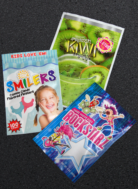
Once upon a time, product packages were merely a container and a label for specifying product details. The only difference between one product and another was the product details and maybe the manufacturer. Today things have changed. Product packaging and labeling must do more than indicate product details. They must catch the consumer’s attention amidst loads of similar products on the shelf. Products must speak for themselves and entice customers to pick them from the store shelf.
Graphics play a fundamental role in product labeling and help your product stand out on the shelves. A popular adage affirms that a picture is worth a thousand words. Similarly, in product labeling, pictures –graphics- are worth a thousand sales when chosen well.
If you sell fresh farm products, then a graphic of a farm animal would be great. Images of farm animals portray a product as natural and organic. Dairy products such as yogurt and cheese and animal feeds often contain the image of cows grazing.
Graphical elements like color help your product to stand out on the shelf. Many businesses use the color white and green to communicate a message about their product. The color white, for example, inspires purity and freshness while green depicts life and organic. One study reveals that a candy bar with a green label is perceived to be healthier than one with a red label even though the calorie content is the same. Additionally, you can use bright colors for your packaging. Bold and vibrant colors not only complement a design but also make the product visible.
Health positioned food brands are notorious for using images of nature. According to the global diversified packaging supplier Sonoco, consumers are more likely to buy a product that is ‘natural-looking’ even if it is more expensive than other products.
Illustrations are a trendy way of making your products stand out on the shelves. They can be strategically designed to show how a product fits into a consumer’s lifestyle. Illustrations are proving to be more inventive than traditional graphics because of their uniqueness, distinct style, ability to harness brand storytelling, and making your brand appear human.
Use the image of a leaf to indicate that a product is organic, gluten-free, or suitable for vegetarians. When choosing products on a shelf, a vegetarian shopper looking for a gluten-free product may choose the one with the picture of a leaf. Also, an image of a leaf on a label can imply freshness, especially for groceries and fruits.
Use images of pets for your pet food labels and packaging. Pet images help to connect with people’s hearts and heads as they shop. Ensure you choose the right breed during your selection process because it says a lot about your product. Instead of portraying pure breeds only, you can depict mixed breed pets on your labels to show customers that you care for pets across the board.
Graphics offer a great avenue to create first impressions and nurture interest in shoppers. Graphics, when done in sync with your products offerings can help beat competition.
Contact Presto Labels & Packaging for graphics that will fly your products off the shelves.
Posted by Jeremy Jarratt on
Every holiday season, customers vote for their favorite products with their spending. And customers, overwhelmingly, let merchandisers know that they like change. A high percentage of your customers will at least try out a new variety. They’re easily tempted with seasonal colors, flavors, and designs. Consider how you can implement the right strategies into your plans and packaging to help attract new customer interest. To start, let’s look at popular trends with enormous potential, like pumpkin spice.
Let’s face it: it wouldn’t be fall without the scent of pumpkin spice wafting through the air. Pumpkin spice flavoring goes in coffee, in baked goods, and even in candies. The scent finds its way into candles and, in many cases, makes its way into stores. The arrival of pumpkin spice on the scene, even in areas where it’s still hot outside, makes many people think of cooler weather, bright reds and oranges and yellows, and the call of bonfires and longer nights.
Trader Joe’s will put out an estimated more than 70 pumpkin spice flavored items. When it comes to the iconic Pumpkin Spice Latte, Starbucks customers admit that 72% of them will buy just one per season, only around 20% will buy two, and just 8% will buy three or more — but that means a wide range of customers who are eager to pick up at least one seasonal item before letting it disappear until the next year.
What is it about pumpkin spice that has become so popular? In part, these familiar flavors and scents are associated with home, family, and the holidays. Simply breathing in the scent of pumpkin spice — and, of course, that familiar flavor rush over the taste buds — often creates a sense of nostalgia. The sense of smell, which is strongly connected to the sense of taste, often evokes strong memories and emotions. With fall reminding many people of cozy, happy times with families, it’s little wonder that pumpkin spice has such a strong impact on its consumers — especially since more than a quarter (29%) of them cite fall as their favorite time of year.
As fall approaches, consider the value that the pumpkin spice trend could have for your business. In the food and beverage industry, it’s important to keep up with the latest trends and offer a hint of something special to your customers with the changing seasons. Consider some of these great ideas: Try a new pumpkin spice version of a favorite product. From fall beers and wines to candles, soaps, snacks, and more, fall is a great time to add a pumpkin spice note to your products. Do you have a place to include a great cinnamon flavor or scent? Do you have an existing product or baked good that could take on a pumpkin spice flavor with a few slight modifications? Consider what products your customers enjoy most, then find a way to help them enjoy it in full pumpkin spice style.
Change up your labels. You don’t need a complete re-brand to change your labels for the fall. Instead, consider adding a few fall leaves, a touch of orange, red, or brown, or using familiar fall imagery — pumpkins, for example — to help evoke that sense of nostalgia in your customers.
Once pumpkin spice season is over, it’s time for the Christmas holidays to roll in. Annually, Americans will spend an average of $704 each on holiday goodies and gifts — and you want your brand to take advantage of that eagerness to spend during the holiday season. With many stores starting their Christmas displays earlier than ever, it’s important to plan your holiday marketing strategy as well ahead of time as possible — and that starts with considering how you can take advantage of the colors of the season.
During the holidays, red and green often bring people in for a closer look. Unless you’re putting together a Scottish plaid, it’s unusual to see red and green together throughout the rest of the year — but those familiar colors in combination let most people know that a brand has taken the time to create a special product for the holidays. As a result, it brings customers back for a closer look.
As the holiday season approaches, it’s time to make the most of red and green opportunities. (Or silver and blue, if that’s what your customers are more likely to expect from your business.) Try some of these strategies:
By simply changing your product’s label or package, you can instantly change your product into an amazing seasonal gift. Even if your product is the same thing customers would buy the rest of the year; a seasonal label or package will encourage customer interest, or convince them your product will make the perfect gift.
Use familiar holiday shapes to help reinvent your products. Whether it’s chocolate reindeer or snowflake-shaped blocks of cheese, simply re-crafting existing designs to fit the holidays can bring a smile to customers’ faces. And it’ll encourage them to try something new!
Try a new flavor combination and market it for the holidays. Just as pumpkin spice is the flavor of fall, winter often is associated with peppermint, especially in conjunction with chocolate. Consider how you can incorporate those familiar flavor options into your plans for the holiday season.
Consider your customers’ needs. It’s not just about gift boxes this time of year. Customers are also hosting and attending parties, from parties intended just for adults (bring on the beer and wine!) to parties designed for children (cookies, candies, and baked goods are more necessary than ever). Consider what your customers need this holiday season. Then make sure you have a product that’s perfect for them to grab on the run.
During the holidays, you want your brand to stand out to your customers positively. If you want to encourage them to choose your product, we can help! Contact us today to learn more about our label creation options, including special labels just for the holiday season.
Posted by Jeremy Jarratt on
Labels are a vital part of any product packaging. They’re not just a decorative sticker you slap on a box or bottle; each label contains vital information which is required by law, industry regulation, or tradition to include. No matter how small your product may be, there are a few basic elements that must be included on every single label, even small containers.
Fortunately, small print isn’t your only answer for fitting branding and information onto a small label or shrink sleeve. Special design principles can be used when your company sells products in small containers. Whether your business is selling cosmetics or hardware, a small container holds a unique challenge which you can tackle with the following tricks:
No matter how small the container, your brand and product names need to be front and center; large enough for consumers to spot your product on a store shelf, or at home. There’s no question these two items will thus take up the majority of your label space, at least half of the front panel, and at least one sixth of a full body shrink sleeve.
If you have a distinct brand logo which can stand in place of the full deco-fonted name of your company, then consider a design substitute. A tidy and unmistakable logo can often fit more cleanly onto a small label than the company name or brand product line.
If you do not have a conveniently shaped brand logo for the label, consider a mild redesign which attractively fits your brand name into a smaller (narrower) space. Alternately, you can invent a new version of the brand name-logo; a distinctive first letter or initials followed by a smaller and/or stacked brand name completion.
Many brands create custom designs and logos for specific products, product lines, and variants of product lines. Travel-sized lotions, for example, might be represented by different, distinctly colored ‘lotion drop’ logos indicating the scent and moisture level of each lotion. A green lotion droplet is much more efficient than writing “Lotion for Sensitive Skin”, which you can print much smaller beneath after giving the visual cue.
Many brands get caught up in the decorative design elements of a label. While it’s true that your labels should be attractive, these design elements seldom have any room on labels for small containers. The key here is to make the decorative elements of your label ambient, so they fill the ‘white space’, rather than needing any designated space which could make the label look cluttered.
Use the color and background of your labels to maximum effect. Make your brand’s labels distinctive by using an unmistakable color or even a detailed pattern as the background of every label. Remember to account for readability in the design with pattern-free spaces for text and other informative details.
You can also make your labels distinct by choosing an unusual shape. A label with an ornately cut arch, or a unique shape, will be much easier to spot because customers can use shape-recognition to pick your product off the shelf.
Don’t forget the design elements for the edges and corners. Flowers or baroque curls in the corners of a label seldom take up vital information space but can set your labels apart from others even on a small container.
Next, you want to think about how you’ll handle all the small print which regulations and tradition insist must be on your product packaging. The obvious way to deal with lots of information on a small container is making the text microscopic. We would rather recommend you use pictographs which explain basic concepts, or you shift the responsibility to the outer packaging instead.
Pictographs are a powerful tool for any brand looking to make tiny labels more readable. If your designers can come up with truly informative images which display the usage instructions and/or warnings for a product without the small print, your customers will appreciate the consideration for both their eyesight and understanding.
The trick to pictographs is to make sure your images are understandable to the average Joe. Consider focus groups to be sure any time you choose to go with pictographs instead of text.
Then there’s the outer package. For many very small labeled containers, there is an outer box with more room to print, or possibly a folded paper insert to explain the rest of the information. Decide carefully when it is appropriate, or necessary, to offload your ingredients, warnings, and instructions to outer packaging labels.
You’ll also want to think specifically about how you will deal with the three types of print elements on your label or shrink sleeve. Each type of information should be treated a little differently.
Customers want to know what’s in their product, but they don’t really need the full laboratory readout. If you have limited space for an ingredient list on the label, keep it simple. List the items your customers care most about (ex: lavender oil, aloe vera, mustard powder, etc.) and put the complex ingredient list on the outer package or insert.
It’s usually best if the instructions for use are on the container, at least in their most basic form. This will allow you to make the print a little larger, use pictographs, or combine pictographs with very few words. Basic instructions can serve as a reminder and a quick guide for customers to prevent accidental misuse of your product. Outer packaging or product web pages can provide more detailed product user guides.
Most necessary product warnings are already paired with recognizable warning pictographs and symbols. Customers already know to watch for these symbols so you can often eschew the text part of the warning or push it to the outer packaging.
Finally, there is the bar code to consider. Every product sold online or in stores needs a bar code to scan. This allows sellers to track inventory and customers to check out quickly at the register. But a bar code can be a tough thing to place on a tiny label. We have two pointers for small label bar codes.
The bar code is a necessary collection of thin and bold lines, but it doesn’t have to be an unattractive or bulky block in your design. It just has to be scannable. So get creative. Use the bar code as a design element. It can be used as a vertical divider between elements or segments of your small container label, or it can be used as a border element along the side or bottom. It can even be shaped as part of a decorative design element, as long as it is scannable.
Of course, for many very small products, you don’t even need a bar code on the inner-container label. A bottle in a box, for example, doesn’t need a bar code on the bottle. Only on the box which will be scanned. So make use of your outer packaging and save small-container label space for the truly necessary elements the consumer will need after the outer carton and instructions are thrown away.
Labeling a very small container doesn’t have to mean sacrificing design elements. With these tips, you can easily design an attractive, distinctive, and regulation-compliant label for your small products with the help of your brand graphic designers. For more labeling tips and tricks of the trade, contact us today!

Posted by Mike McDermott on
A well-designed product label will not only help attract the attention of prospective consumers but also makes a statement about your brand. Your label plays a role in building brand identity.
There are a lot of reasons why the appearance of your product’s label is crucial to your business’ growth; the main reason being an outstanding label helps your product stand out from the competition. Another vital reason is that labels have a role in influencing buying decisions of people who are shopping; even customers who are on the fence regarding what to buy can be convinced to purchase your product based on the label.
According to a study done on shopping behaviors, 70% of people make purchasing decisions while in the store. The study found that 1 in 10 shoppers switch brands while shopping. The reports from the study further imply that your brand’s success has a lot to do with your product’s presentation; making label design crucial.
For this reason, this article will look at a few label and package design tips. Based on real-world examples, we’ll look at do’s and don’ts of branding from national brands perspective:
The Dont’s
The Do’s
A product label can help you build an excellent brand identity for your business. Contact Presto Labels for legible and sophisticated label designs.

Posted by Mike McDermott on
A well-designed product label will not only help attract the attention of prospective consumers, but also makes a statement about your brand. Your product label plays a role in building brand identity.
There are a lot of reasons why the appearance of your product’s label is crucial to your business’ growth; the main reason being an outstanding label helps your product stand out from the competition. Another vital reason is that labels have a role in influencing buying decisions of people who are shopping; even customers who are on the fence regarding what to buy can be convinced to purchase your product based on the label.
According to a study done on shopping behaviors, 70% of people make purchasing decisions while in the store. The study found that 1 in 10 shoppers switch brands while shopping. The reports from the study further imply that your brand’s success has a lot to do with your product’s presentation; making label design crucial.
For this reason, this article will look at a few label and package design tips. Based on real-world examples, we’ll look at do’s and don’ts of branding from national brands perspective:
Always keep in mind the rules and regulations placed on product labels by the FDA. Breaching those means your product won’t be cleared for the market, affecting not only your business but your brand.
Avoid overloading the label with information; make the information clear and easy to read. Avoid using too many graphics as well; one main logo is often enough to grab a customer’s attention.
Incorporate the same design elements in all of your product labels to maintain brand consistency.
Before choosing a label, shrink sleeve or flexible package, test its performance with your product. The packaging must fit the product’s form, function and lifecycle.
While innovation is accepted, try not to leave your audience behind. By understanding your product’s unique offering, you will be able to engage potential buyers. Your loyal customers will always appreciate a classic product label.
While shocking advertising can be popular, it could hurt sales if not wisely thought out and executed.
Your label should match the uniqueness of your product. Take your time to pick the right mood, message, and emotion you want your label to convey.
You don’t have to have a label that covers your entire product; a smaller label design could be perfect not only for the look of the package, but for the labeling costs.
Everyone wants to stand out, but your label still needs to be obvious in terms of conveying a message about your product. Find the right balance between aesthetics and practicality and remember; less is more. When your label has a lot going on, it will throw off customers. Make it easy for customers to find product information, or else they will move to another brand.
Keep in mind the product’s environment; will it be placed outdoors or indoors, does it have to be heat or water resistant? Also, consider the impact your packaging will have on the environment. Durable packages such as bottles or glass jars are often recycled; and flexible packaging might be the most convenient packaging for the consumer and have a reduced carbon footprint.
Keep the product’s name front and center. It should have the largest font size. Include contact information on the product label; list the name of the manufacturer as well as their physical location. It is vital to note that the FDA does not consider a PO Box adequate for small businesses that deal with food or cosmetics.
Make sure that the typeface you use for important information on the label can be read from afar. The color you choose also adds to the readability; a reflective label can be catching to the eye, but when paired with certain colors can be hard to read. Consider the psychological interpretation placed on colors; brown paper can convey earthiness; blue conveys authority and trust. Keep the colors consistent; if you are conveying flavor, have colors that match.
Whether your packaging is rounded, squared, or textured, it is important that you make sure your label smoothly fits onto it and complements the shape of the package. Also, consider whether you would like to show the product. If the product or container is attractive, consider a transparent label.
High-end brands can purchase specially crafted displays located in strategic positions in stores, but most times, products appear alongside competing brands. A catchy, clean, and somewhat unusual design will have a more significant impact. Consider these few questions when designing the label:
For homemade, farm-to-table, distinct new flavors, and for product made in unique small batches, use textured paper for a craft experience. Need a clean medical look? Then choose a smooth, clean white material. Need to add glitz and stand out? Consider a metallic or prism material to add eye-catching pizzazz.
The most important thing to do for your business is solidifying your brand’s identity. Having a brand color scheme and font helps consumers recognize your product is essential. A consistent look makes it easier for the consumer to find and repurchase your product.
A product label can help you build an excellent brand identity for your business. Contact Presto Labels for legible and sophisticated label designs.
Posted by Mike McDermott on
By nature, Michelle Mazzara is a salesperson. With 25 years of experience selling national “A” brands to a diverse customer base, Michelle suddenly found herself unemployed when the company she worked for went under. She was in her mid-40s, unemployed and wondering what to do with her life. An idea hit at 3:00 am, launching Michelle into entrepreneurship.
Michelle was single and looking for a change. She had a passion for food and beverage. Why not start a website for singles that shared her same foodie passion? Researching her idea, Michelle couldn’t find anything else like it. However, she also found it inappropriate for the owner to be on the website looking for a match. So in August of 2014, Michelle set out to create a website for those in the same boat she was—single foodies. Although it was a great idea, within six months, Michelle found herself fighting against huge dating websites and realized she really didn’t have resources to make it work. Instead of a dating site, Michelle went back to what she knew best; she came out with food products she could sell. Her first creation, caramels, was a huge hit, so she developed more products. Michelle introduced a line of gourmet spices under Luvafoodie brand, followed by Belgian chocolates and drink mixes. Her consumable brand soon phased out the dating site.
In 2016, Michelle experienced chest pains that would not go away. Her doctor misdiagnosed her with costochondritis, an inflammation of the cartilage in the rib cage. Friends and family told Michelle her chest pain was due to stress. She continued to live with the pain, as it continued to worsen for 10 months. Michelle returned to her doctor, and he ordered an angiogram with contrast. An 80% blockage was found in her left anterior descending artery. Michelle had a stent inserted to open her artery. During surgery, some plaque traveled to a neighboring artery causing Michelle to have a heart attack while in recovery. “This changed my life and my perspective of what I really wanted to do with the brand and my vision for the company,” Michelle stated.
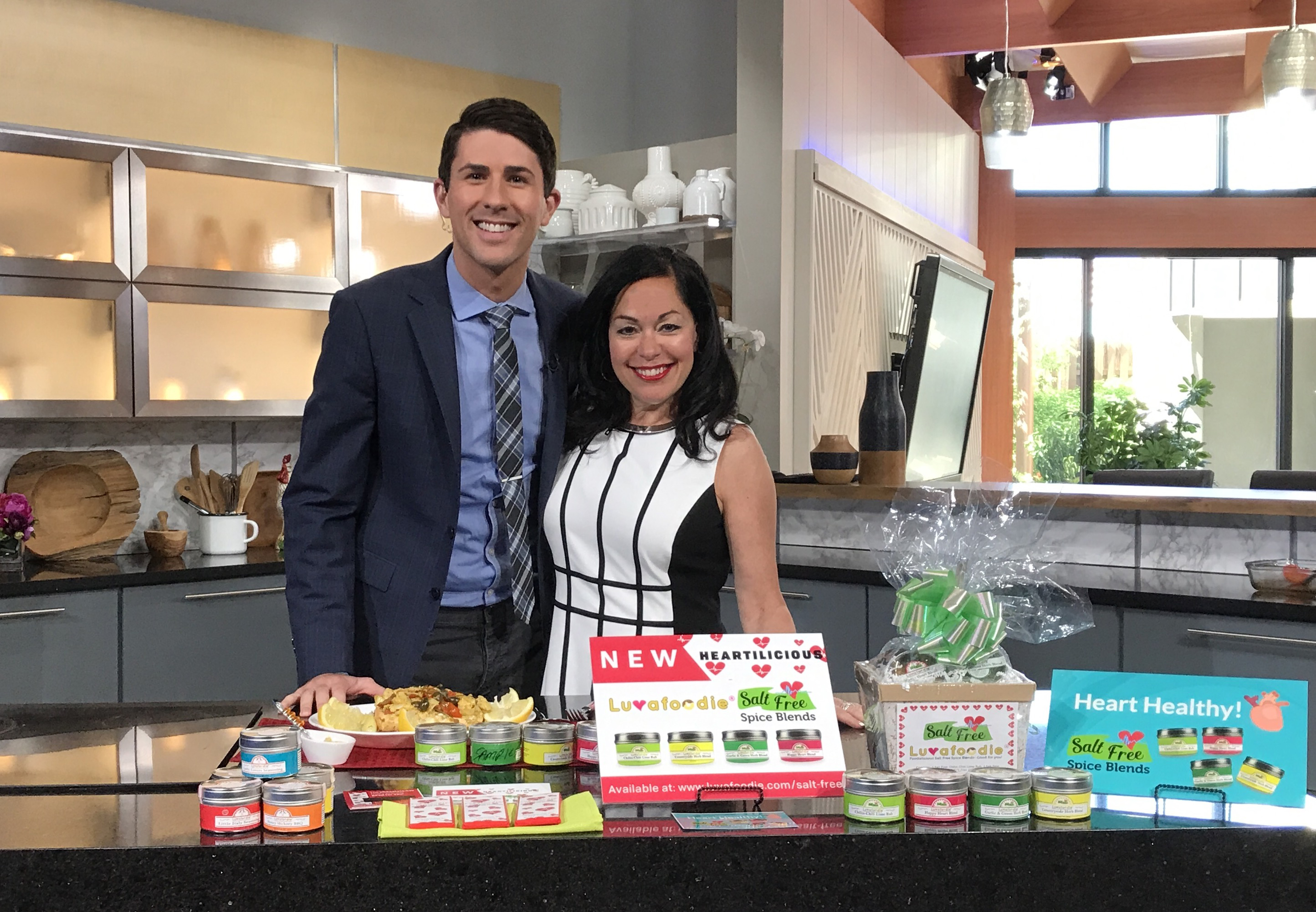
 Due to living with heart disease, in January 2017, Luvafoodie launched a salt-free spice line and a new Happy Heart Dark Chocolate Belgian Bar. In May 2017, Michelle added spiced cheese curds from Metz’s Hart-Land Creamery, using Luvafoodie spice blends.
As a survivor of heart disease, Michelle was selected to be a Brand Ambassador for the Twin Cities’ American Heart Association Go Red Women 2018 Ad Campaign in Minnesota. Michelle states, “Heart disease is the number one killer of women, and it is the most misdiagnosed in women. My mission is to help increase awareness and to inspire other women to take charge of their own health. My mission is to make a difference in peoples’ lives and help prevent heart disease.”
In January of 2018, Michelle’s beloved 14-year old dog, Lucy, stopped eating and was diagnosed with cancer. Michelle researched different types of food and supplements that would help her with Lucy’s nausea and cognitive loss due to brain cancer. In her research, Michelle found that there are many herbs that may help boost the nutrition for a dog or a cat, especially aging dogs and cats who suffer from cancer. Luvafoodie’s new Dog Lovers and Cat Lovers spice blends are meant to supplement a dog and cat’s diet through adulthood by boosting it with nutrition derived from natural herbs.
 So what’s next? Well, Michelle shared with me that she has written a new cookbook, Luvafoodie Eat Clean, Be Well and Stay Well Cookbook, with salt-free recipes. Her cookbook is now downloadable on Kindle, or can be purchased on her website. She has also come out with a new gift of hope chocolate bar “Touched by Miracles”. In 2019, Michelle will be looking for investors to help take her brand national.
As Michelle’s life evolves, so does her company, Luvafoodie. We can’t wait to see what happens in the next chapter of Michelle’s life and brand—rest assured, whatever happens, it will be close to her beautiful heart.
Posted by Mike McDermott on
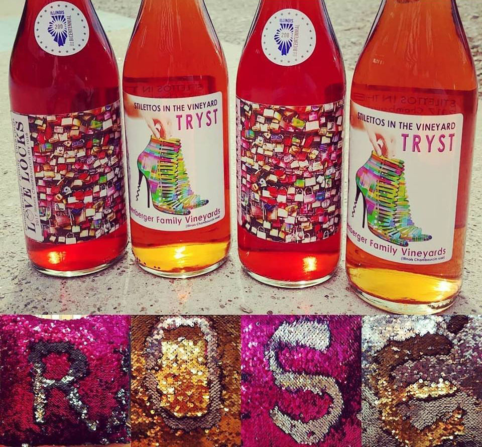
Working in a man’s world of winemaking is hard work, and Susan Sullivan Danenberger is doing it in style—yes, you’ll actually see her working in her vineyard wearing high heels! But Susan isn’t just a female winemaker with fashion sense, she is a single mom who has raised her kids, she is a survivor of breast cancer for the second time, and she is keeping her family legacy alive. Located just 15 minutes outside of Springfield, Illinois in New Berlin, the Danenberger Family Vineyards is a destination experience filled with great food, drink and history.
 On March 12, 2006, a tornado ripped through New Berlin, destroying the Danenberger Family Farm. Susan started rebuilding the back half of the property. It has taken years to rebuild, one construction project at a time. So far, the Tasting Room, Wine Rocks Stage and Upper Terrace, Crate Lounge, Gazebo, West Terrace and Depot have been constructed.
 Intimate nooks and party rooms, for indoor and outdoor experiences, are paired with fine wine. You can enjoy a sip, glass or bottle of wine with single or group tastings in one of the many lounge areas throughout the venue. Gather a group of friends together and experience a full course pairing dinner in the gazebo prepared by Chef Clayton Danenberger (Susan’s son). Or, relax by the fireplace while Chef Clayton creates a delightful crisp cheesy pizza baked in their wood burning pizza oven. If you are in the mood for live music, check out the bands and dates that will be playing at the Danenberger Family Vineyards. You’ll experience a sbeer, wine, mixed drinks and really friendly people.
 What started as Susan’s hobby grew into award-winning wines and then a developed venue. Susan shares her mature tasting skills in her wine; chewing the cuttings and looking for flavors that she wants to enhance or downplay when developing her wines. This is where Susan could have power over her male counterparts; scientific studies have determined women have better sensory palates than men!
Being a woman who has survived breast cancer has given Susan another power—the power to give back. She raises money and awareness for breast cancer and other women’s issues. In February of 2019, you will find Susan modeling an Ana Ono bra for cancer patients in New York fashion week.
It takes a strong woman be a single mom, to compete in a man’s world, to rebuild after a tornado destroys your home and business, to survive two rounds of cancer, and to create award-winning wines and a venue that delights customers. Take a road trip and meet this amazing woman—and take a group of friends with you. Say hello to Susan for me.

Posted by Mike McDermott on
When is the last time you had a really good shot of moonshine? At Twin Stills Moonshine Distillery in Long Island, New York, you can have a shot of 100 proof corn moonshine, or have a shot of some of the finest whiskey infused with natural flavors. After being in business for only three years, Twin Stills Moonshine Distillery is already outgrowing its facility. Their LI o’OldTymer Whiskey and LI o’OldTymer Moonshine products are flying off the shelves!
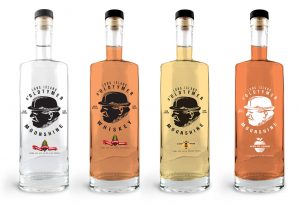 Joe Cunha started this business by setting out to duplicate his grandfather’s “Grappa”. When he was 14, Joe remembers being in charge of the still while his grandfather farmed his land in Portugal. Growing up, Joe made many trips to Portugal with his parents, usually in the winter months when the stills were going full throttle. Along with brandy, there were always different infusions of spirits that his grandfather would put together. After his grandfather passed away in 2006, Joe and his wife Patty set out to create an infusion like Joe’s grandfather made in Portugal—a spirit that would appeal to the mainstream of people who wanted a smooth, drinkable shot. To reproduce whiskey and moonshine as authentic as grandfather’s “Grappa”, Joe and Patty went to Portugal and handpicked and shipped their twin copper stills and handmade tasting cups. To this day, Twin Stills Moonshine Distillery makes their LI o’OldTymer Whiskey and LI o’OldTymer Moonshine like the grandfather, in single small batch distillation, aged to perfection (whiskey), or not at all (moonshine).
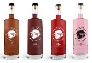 Twin Stills Distillery is a licensed agricultural distillery, buying most ingredients locally in New York. Corn, strawberries, and apples are purchased from neighborhood farms. All of the ingredients that go into their whiskey and moonshine products are natural, with no added artificial colors or sweeteners. Therefore, some of their products are seasonal, such as strawberry moonshine, which is only made when the strawberries are fresh and flavorful.
Twin Stills Distillery is already licensed in New York and Illinois, and this year, a distributor will be bringing their product into Florida and Michigan. To keep up with orders, Joe and Patty will be looking for a larger place in the fall.
Why is Twin Stills Distillery growing so fast? Well, the family is very particular, guarding every aspect of their product from the recipe to its label. They design their own labels, and their small-batch whiskey and moonshine are hand bottled and hand labeled. The love for their craft is evident, as well as their love for family. The most important thing to Joe and Patty is to make you feel comfortable and welcome the moment you walk in the door. Their fabulous shots of whiskey and moonshine will keep you coming back—a perfect recipe for success.
Posted by Mike McDermott on
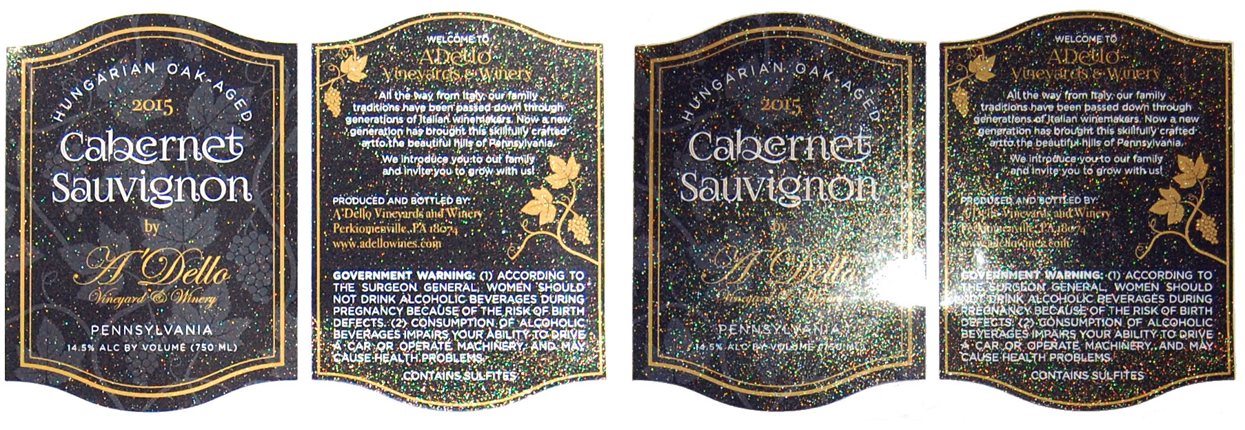
Dazzle your customers while protecting your product’s label. Presto Labels’ glitter overlaminate will add sparkle and depth to your label. This overlaminate will enhance the richness of your labels while adding that much needed “bling” to stand out among the competition.
Tiny gold specks of glitter overlay your label. Depending on the direction you are looking at the label, and the light in which the label is held, the glitter grabs attention without distracting from the readability of the label.
The glitter overlaminate is a 1.0 mil clear Biaxially Oriented Polypropylene (BOPP), which provides additional overall stability to the label. It is acid, chemical, oil and scuff resistant. The glitter overlaminate is a perfect decorative addition to nail care labels, cosmetic labels, wine labels, or any high-end product that needs added bling.
ARVE error: Mode: lazyload not available (ARVE Pro not active?), switching to normal mode
Contact customerservice@prestolabels.com to have a sample sent to you, for a quote with glitter overlaminate, or for more information.
Click to view the Gold Glitter Overlaminate spec sheet
Posted by Mike McDermott on
Most weddings I have attended are based on a color scheme. The bride’s maid dresses, flowers and table décor all tout the same color, or shade of color. The unusual wedding I just attended did not have a color scheme; instead, the bride chose a movie theme. The groom’s men and bride’s maids wore classic black and white attire. Dimmed lights set the mood at the reception with eight large-screen televisions playing a variety of movies with closed captions; from classic Bugs Bunny cartoons for children, to the Wizard of Oz, to the bride and groom’s all-time favorite movies. In the background, movie soundtracks played softly beneath the buzz of excited chatter.
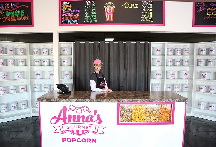
 Instead of an open liquor bar, they offered IBC Root Beer®, Coca-Cola® products, craft beers, and champagne. Along one wall of the reception room, the bride set up the most wonderful popcorn bar I have ever seen, or tasted! There was jalapeno white cheddar popcorn, butter popcorn, cheddar cheese popcorn, birthday cake popcorn, salt & vinegar popcorn, caramel popcorn, cinnamon popcorn, very unusual caramel apple popcorn, and a red white and blue mix that was blueberry, cherry, and vanilla flavored popcorn. The guests filled their bags and mixed flavors. I just had to keep going back to try all them all! I asked the bride how she came up such an idea and found out the popcorn was from a small business in Lebanon, Ohio.
 If you have ever been to the historic Golden Lamb Inn & Restaurant, Anna’s Gourmet Popcorn is just down the street. Anna’s Gourmet Popcorn offers wedding packages, or like our bride, you can customize your own popcorn bar. You choose the number of tins, flavors, and bags of popcorn to fit your wedding. Actually, Anna’s Gourmet Popcorn is a great idea for any type of party or event, and they also have fundraising options.
Before starting her business, Anna worked in the flavor industry. For over a decade, she helped entrepreneurs create energy drinks, shots, kids’ drinks, and waters. Developing international brands made Anna realize she wanted her own business. She took her flavor experience and combined it with her love for popcorn. To keep her brand fresh and interesting, Anna comes up with monthly popcorn flavors, which are a combination of seasonal favorites, customer requests, and her own unique flavor combinations.
If you visit Lebanon, Ohio for the Annual Lebanon Horse Drawn Carriage Parade & Festival, held on the first Saturday in December, you’ll find Anna’s Gourmet Popcorn there supporting the community. Horses and carriages from all over the United States participate in this event. The event features two parades; the first parade is held at 1 pm and the second parade is at 7 pm. Check out the craftsmanship on the carriages and the variety of horses that pull them; minis, Clydesdales, Percherons and many more. It is a fun day filled with holiday cheer—and of course, Anna’s popcorn!
Regardless, if you savor salty or sweet snacks, Anna’s Gourmet Popcorn will satisfy your craving. I urge you to create your own popcorn bar at your next office party or event. Everyone will want to sample all the flavors—and your event will just be more fun. Keep supporting those small businesses. They offer such unique and creative products!